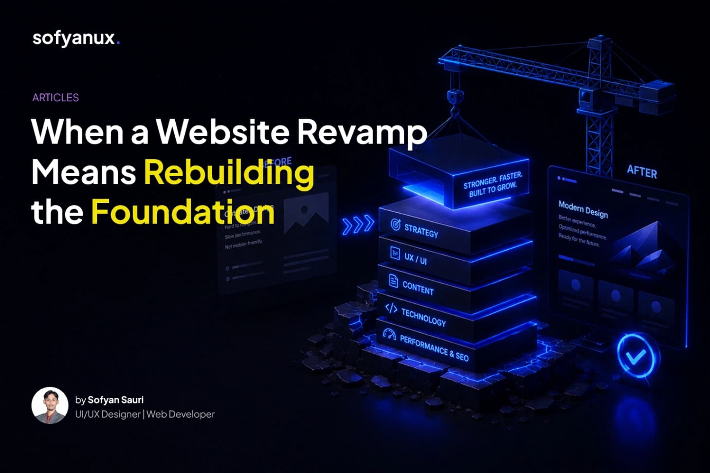
When a Website Revamp Means Rebuilding the Foundation
Sometimes, the best feedback isn't a testimonial.
It's when a client comes back.
Around the end of 2024, I first worked with Pradipta Adhi Cipta on their website.
At that time, the goal was relatively simple: clean up the Study Case pages and make them more consistent.
The website was already built with WordPress and Elementor, but the platform wasn't being fully utilized. As the number of Study Cases grew, many of them were created manually using individual WordPress Pages.
It worked.
But it wasn't exactly a structure that would be fun to maintain as the website continued to grow.
From Manual Pages to Dynamic Content
During that first project, I suggested turning the Study Case section into a more dynamic system.
Instead of creating every new Study Case from scratch, I built a reusable template powered by ACF (Advanced Custom Fields).
The idea was simple:
separate the content from the layout.
The team could manage the information, while the template handled how that information was presented.
It made adding new Study Cases much more manageable.
And then, the project was completed.
They Came Back
Fast forward to early 2026.
Pradipta reached out again.
This time, they didn't just want to clean up a few pages.
They wanted to revamp the website as a whole.
After reviewing the existing website, I realized that simply redesigning the current structure would eventually create more problems.
The existing content structure had already grown around the old way of managing the website. And with different types of Study Cases continuing to grow, making everything more dynamic would become increasingly difficult.
So instead of trying to patch the existing structure, I suggested something more fundamental:
Let's rebuild it from scratch.
Not because the old website couldn't be improved, but because starting with a cleaner foundation would make the new website easier to manage, organize, and develop in the future.
The Visual Direction
For the new visual direction, the client provided Rise at Seven as one of the main references.
The reference had a very modern visual language, strong typography, subtle interactions, and quite a lot of animation.
The challenge?
I needed to achieve a similar experience while still working within a WordPress + Elementor Pro + ACF ecosystem.
That meant finding the balance between:
modern visual design
flexible content management
custom interactions
maintainable structure
and website performance
The visual side was actually quite straightforward once the direction was clear.
The real challenge came later.
Performance.
When Design Meets Performance
The website uses custom CSS, JavaScript, and various animations to recreate the desired interactions.
And this is where things became a little tricky.
Some performance optimization techniques that work well for a typical WordPress website can interfere with custom CSS and JavaScript.
Minifying, delaying, or combining certain assets may improve a performance score, but at the same time, they can affect animations, interactions, or even the way certain components are rendered.
So optimization became a process of finding the right balance.
At the moment, the website still has room for improvement, especially when measured through PageSpeed Insights.
The score isn't where I want it to be yet.
But there's another side of performance that I also consider important:
real-world user experience.
In normal usage, the website remains comfortable to browse on everyday connections, including 4G.
So the optimization process is still ongoing.
More Than Just a Visual Redesign
This project reminded me that a website revamp isn't always about making an old website look new.
Sometimes, the bigger challenge is underneath the interface.
A better-looking website built on a difficult-to-maintain structure will eventually become difficult again.
That's why, in this project, the redesign was only one part of the process.
We also had to rethink:
"How should the content be structured?"
"How should new Study Cases be added?"
"How can the website remain flexible as the business grows?"
And perhaps most importantly:
"How can we make the new website easier to manage after the project is finished?"
That's what made this project interesting to me.
It wasn't simply about rebuilding a website.
It was about giving the website a better foundation for whatever comes next.
Final Thoughts
From a small Study Case cleanup project in 2024 to a complete website revamp in 2026, this project has been a good reminder that digital products often need more than a visual refresh.
Sometimes, you have to step back, rethink the structure, and rebuild the foundation before the new experience can really work.
And honestly, that's probably one of the most interesting parts of working on websites.
The things users don't see can sometimes have the biggest impact on what they experience.
Reference: Rise at Seven
Result: Pradipta Adhi Cipta